YP can do that.
In 2013 the Yellow Pages became YP. An agency designed the new brand. Our in-house team had to make it real everywhere people would meet it: a train station, a highway billboard, a phone, a sales call and a school fundraiser.
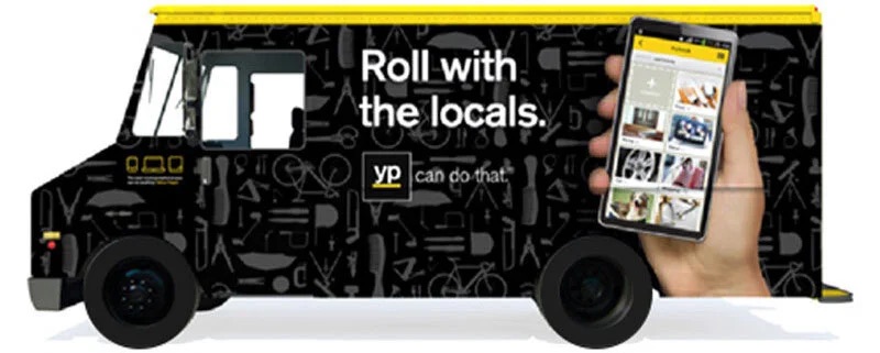
The Yellow Pages had been around since 1886. Now it had to be an app people chose.
With print in decline, the company rebranded as YP, "the new way to do." Interbrand New York created the strategy and identity, and BarrettSF made the launch advertising. The brand spoke to "doers": people with a list of things to get done.
The identity was built on a doer's gestures. The yellow stopped being decoration and became a tool that pointed to the answer. That gave us something more useful than a logo. It gave us a behavior to repeat in every piece we made.
Source: Interbrand, via CI Portal, Sept 2013. Gestures redrawn for this page.
One line had to work at forty feet and at eighteen seconds.
YP built an agency-model creative team inside the company. It handled the consumer campaign and supported a sales force of more than 3,000 people selling YP's marketing products to small businesses. That meant the same idea had to stretch across very different jobs.
Out of home
- Grand Central station domination
- LA billboards
- Building wraps
- Stadium signage
Film
- National :60
- Celebrity influencer films
- App shorts for social
- B2B product videos
Print and digital
- Magazine ads
- Display and retargeting
- Social content
Experience
- Food truck activations
- Agency events
- Campaign website
- App design concepts
Sales
- Sales website rebrand
- Live search data tool
- Print and tablet sales kit
Community
- YP for Schools fundraiser
- App screens and email
Brand care
- Brand compliance
- Trademark management
Partners
- Internal clients
- Outside agencies
- Data team
We took over Grand Central while the whole ad industry walked through it.
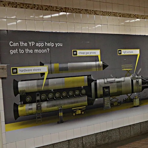
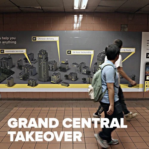
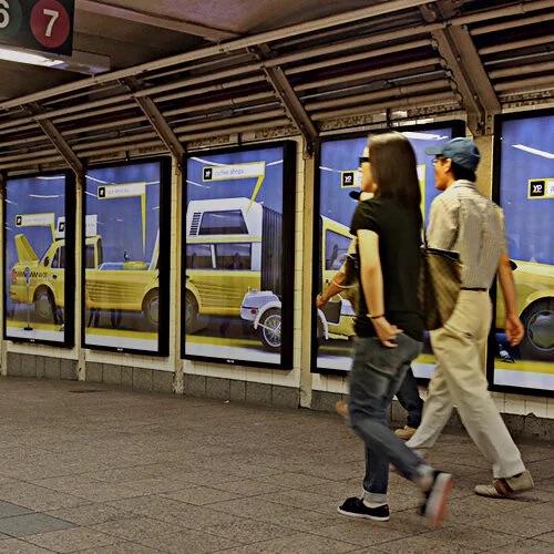
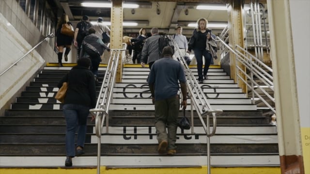
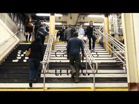
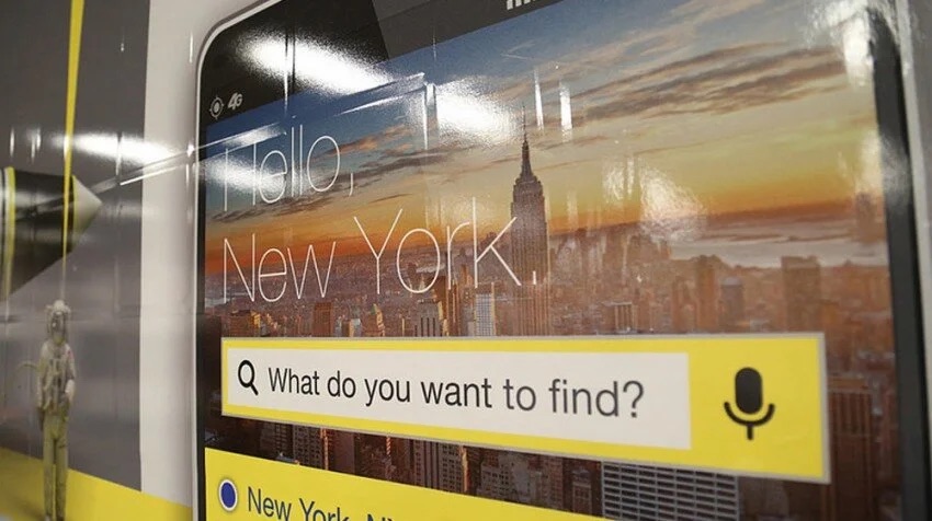
From September 8 to October 4, 2014, YP covered Grand Central Terminal during Advertising Week, the month marketers descend on New York. The terminal is one of the most visited places in the world, with close to half a million people passing through each day.
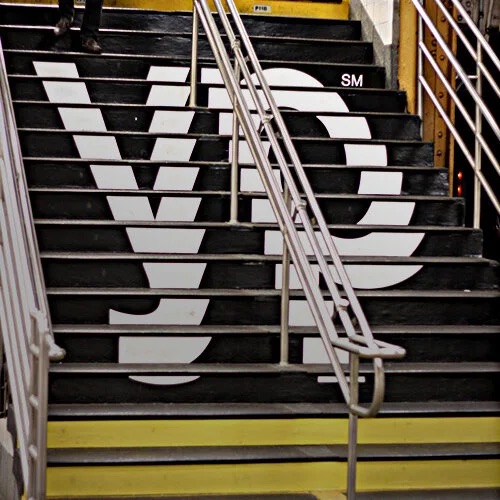
A station domination only works if it feels like one idea, not a hundred ads. The stairs carried the logo. The walls asked "Can the YP app help you get to the moon?" and answered with a rocket built out of everyday searches, each tagged with the yellow bar. It was the same question the national commercial asked.
Then the line went national, from an astronaut to a food truck.
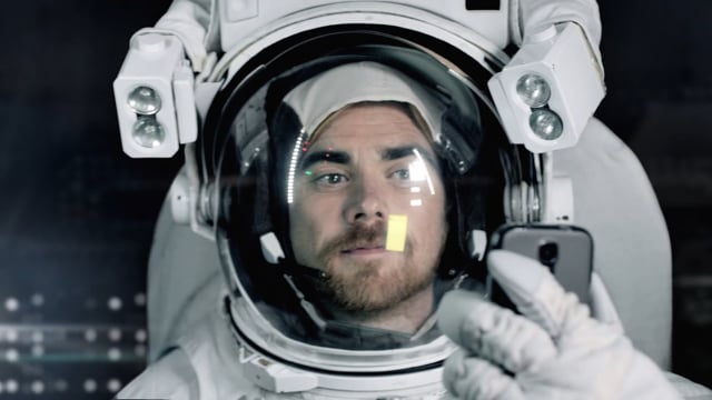
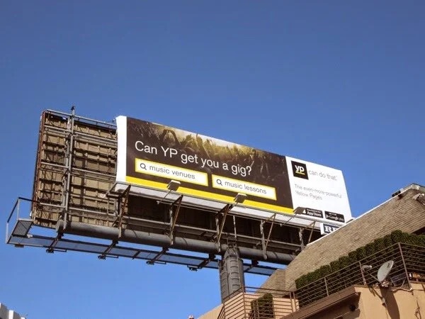
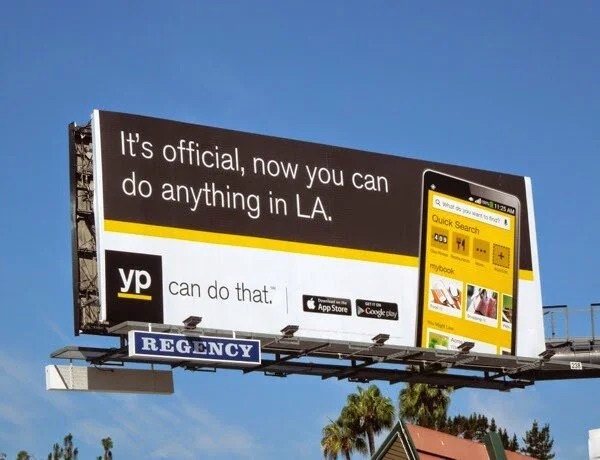
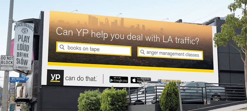
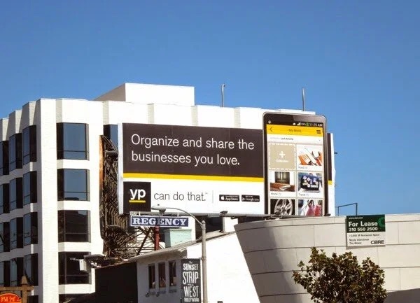
I worked with internal clients and agencies on YP's national commercial: an astronaut who uses the app to get where he's going. Around it, the campaign ran everywhere a doer might look up. Billboards and a building wrap in Los Angeles. Magazine ads, display and retargeting, stadium signage, social content, food truck activations and agency events.
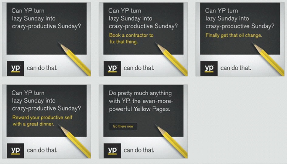
Every piece asked a version of the same question, "Can YP...?", and answered it with a real search sitting on a yellow bar. That one repeatable structure is what let a small in-house team produce a national campaign without it falling apart.
Watch · 1:01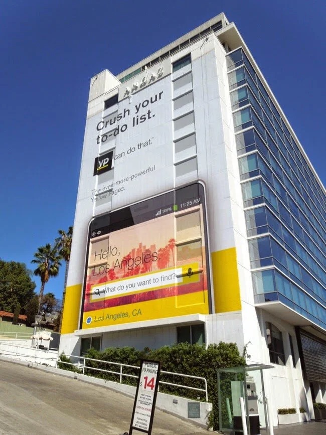
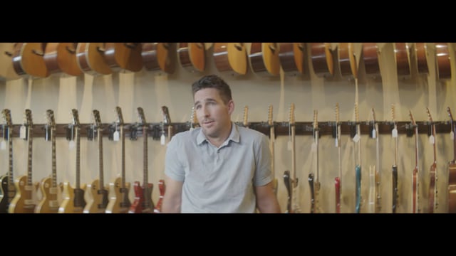
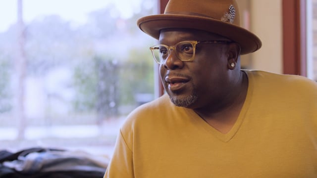
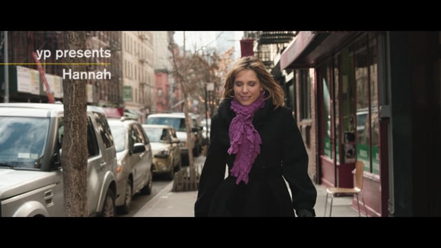
Celebrities showed how they live local, and the site had to turn that into app downloads.
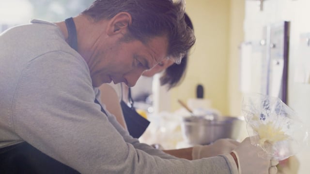
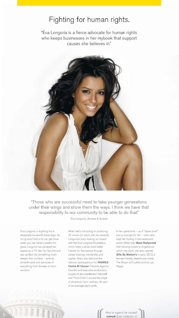
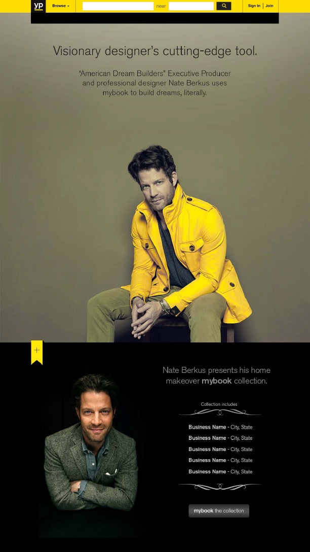
Make Every Day Local was built to drive brand consideration and app use. Well-known people, from country star Jake Owen to Cedric the Entertainer, sportscaster Hannah Storm and Ty Pennington, shared the local places they love, saved in the app's mybook feature.
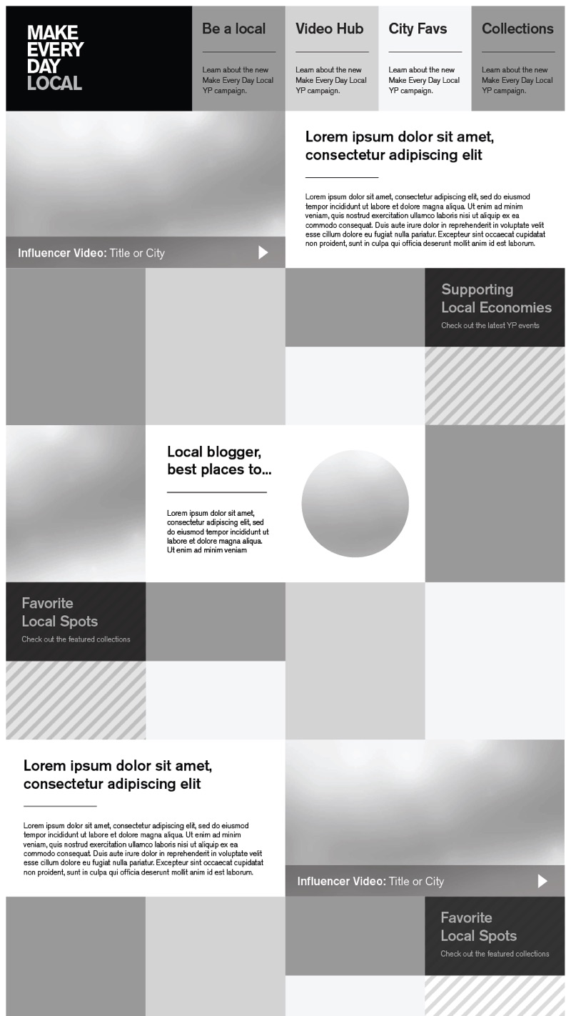
I led the UX and UI for the campaign site: discovery, user flows and a modular framework. Instead of a grid of videos, each influencer got a scrolling story page that tied their film to their brand and to the businesses in their collection, with a clear path into the app.
 1:44
 2:28
 0:30
 2:09
From flow to finished page
UX/UI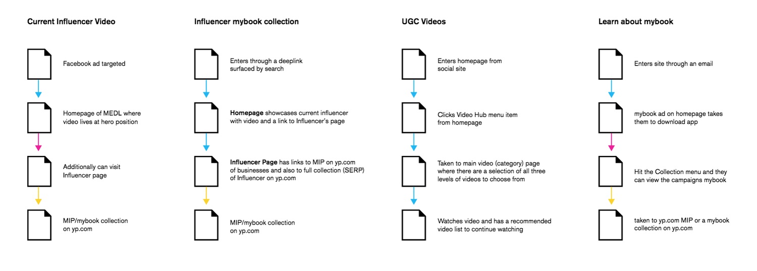
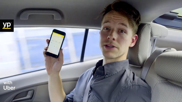
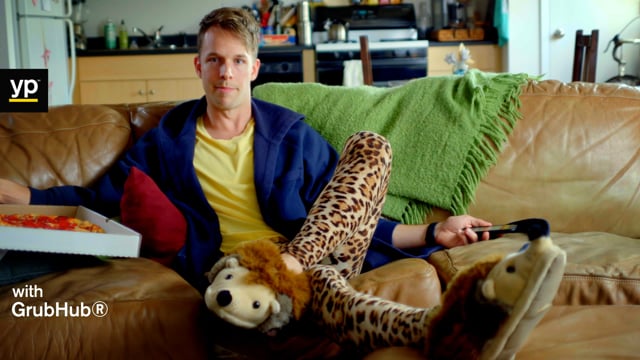
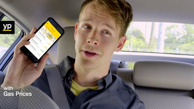
Eighteen seconds to show one thing the app could do.
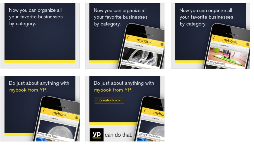
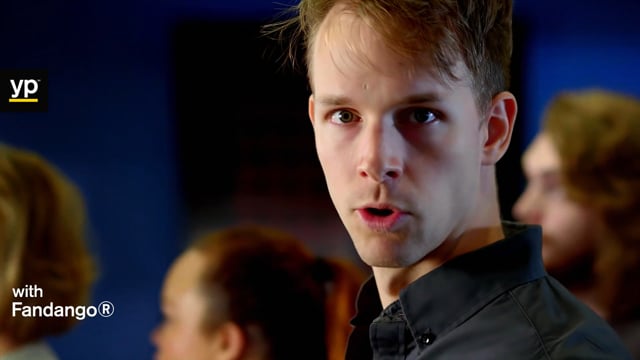
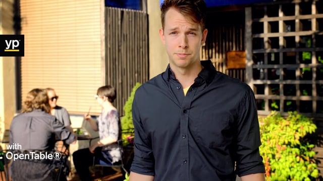
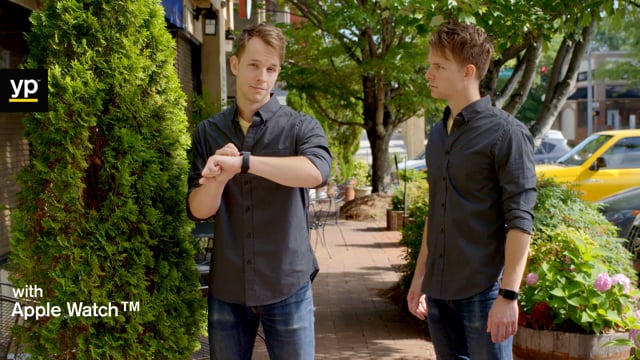
The app was the product the whole campaign pointed to, so it needed its own content. A series of short social films each showed one real job the app handled, paired with a partner people already used: Uber, GrubHub, Fandango, OpenTable, gas prices and the Apple Watch. I also art directed a video series for mybook, the feature that saves your go-to businesses in collections like Home, Car, Kids and Date Spots.
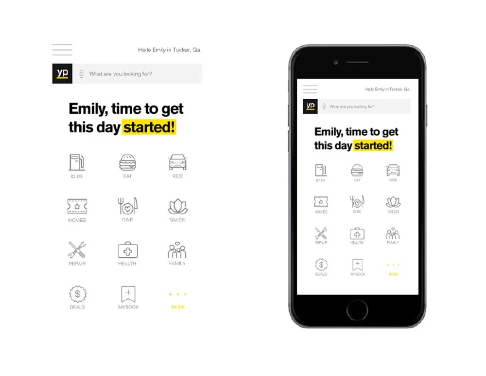
Through my studio, The Creative Life, I also pitched two UX directions for a cleaner app that surfaced the most-used features first.
 0:18
 0:18
 0:18
 0:20
 0:19
 0:18
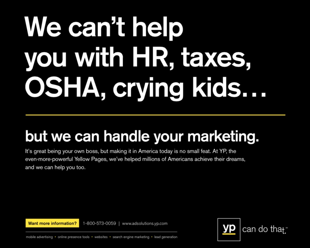
YP made its money selling marketing to small businesses, so the brand had to sell to them too.
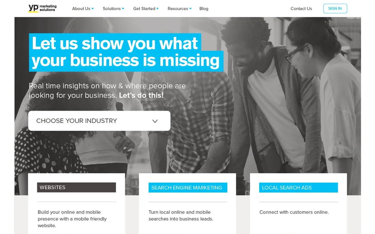
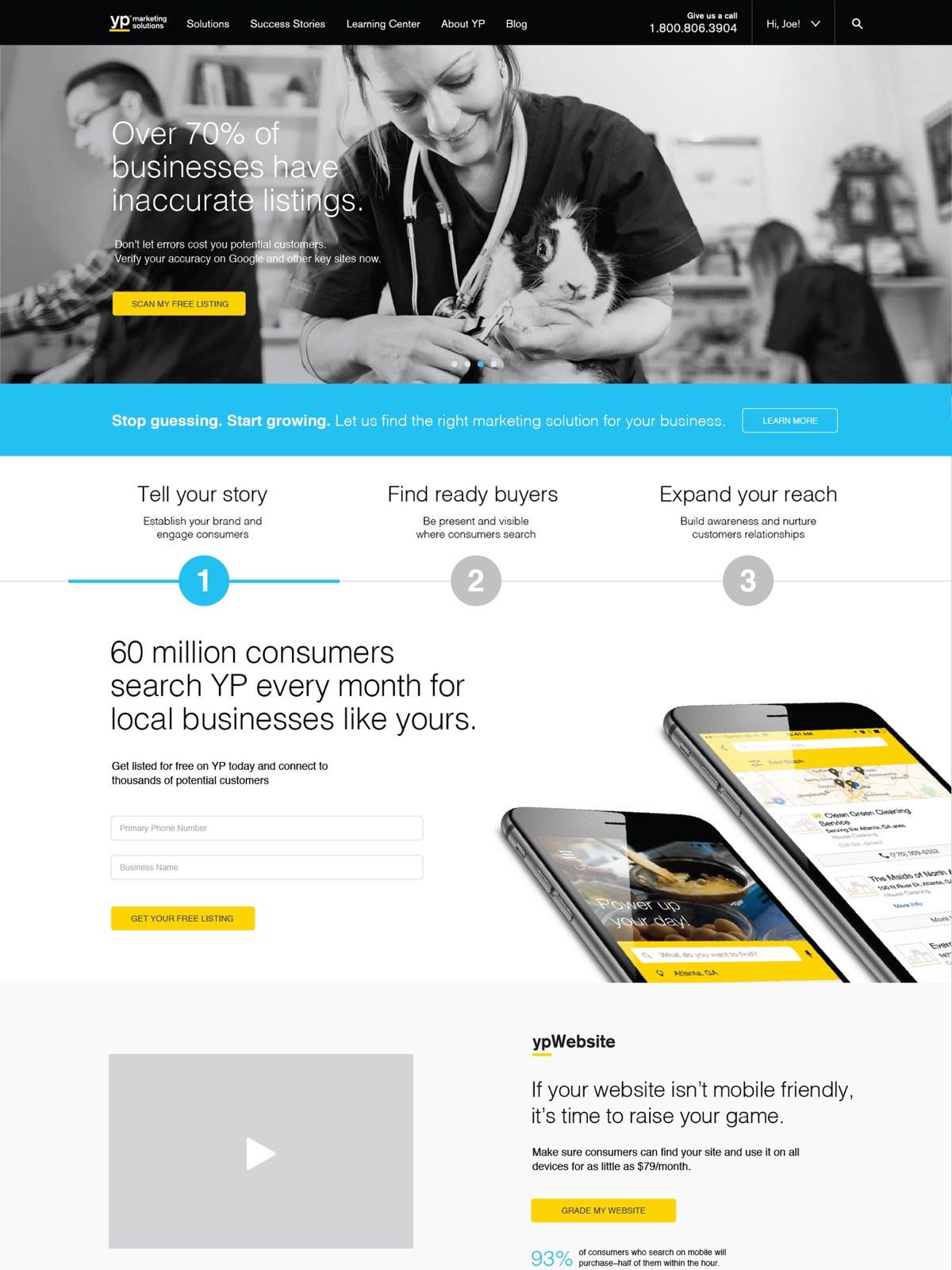
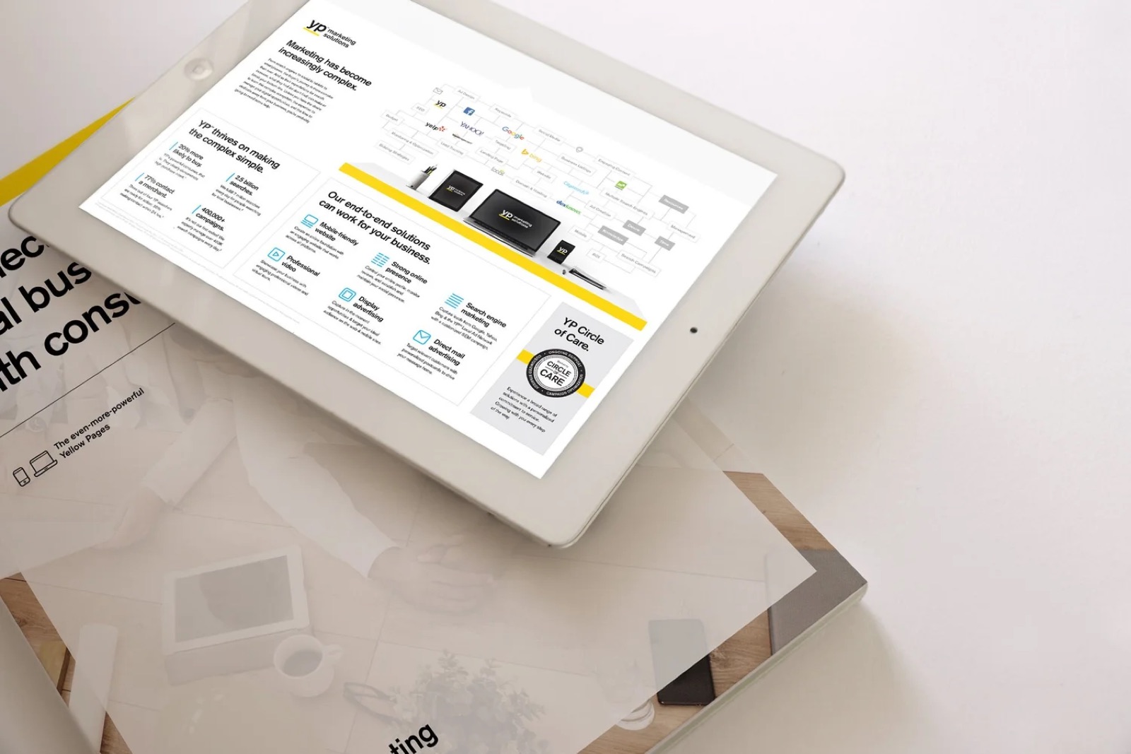
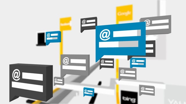
Behind the consumer app was YP Marketing Solutions, which sold search, display and web products to local businesses. I rebranded its main sales website. Visitors jumped between three product types, so I used color to set a clear hierarchy of calls to action and built a large submenu that walked each visitor to what they needed.
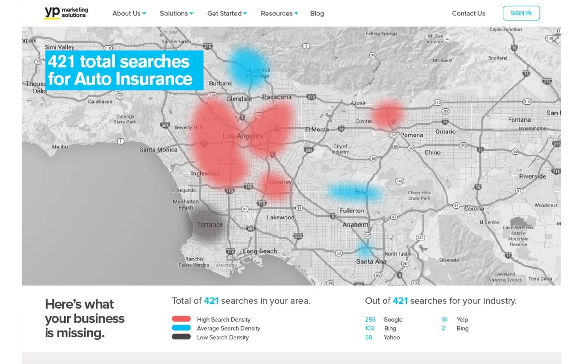
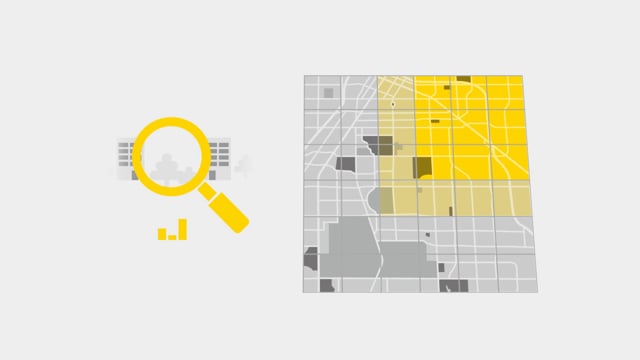
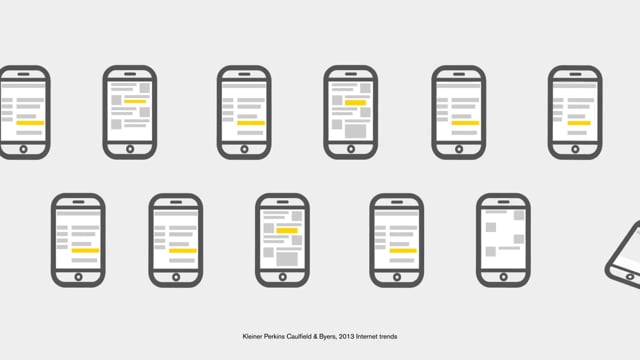
Then we let the data do the selling. Working with YP's data team, I designed a homepage tool that turns a visitor into a lead in two inputs. An owner picks their industry and enters a zip code, and the site maps the local searches they're missing without digital marketing. A series of motion graphics product videos and a print and tablet sales kit carried the same look into every pitch.
- Pick an industryA low-risk way in. No form, no commitment.
- Enter a zip codeTargets the owner's own neighborhood.
- See the searchesA live map of local demand for their type of business.
- See what's missedThe gap becomes a lead for sales.
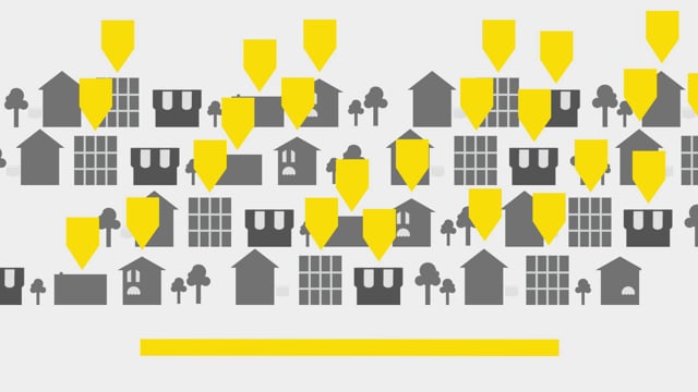
A fundraiser that turned parents into reviewers.
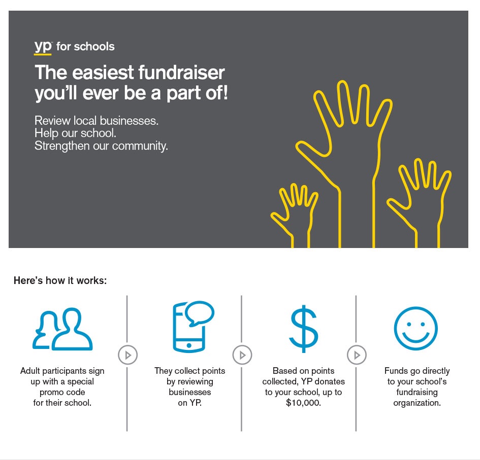
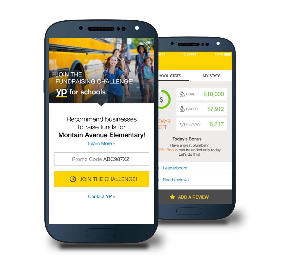
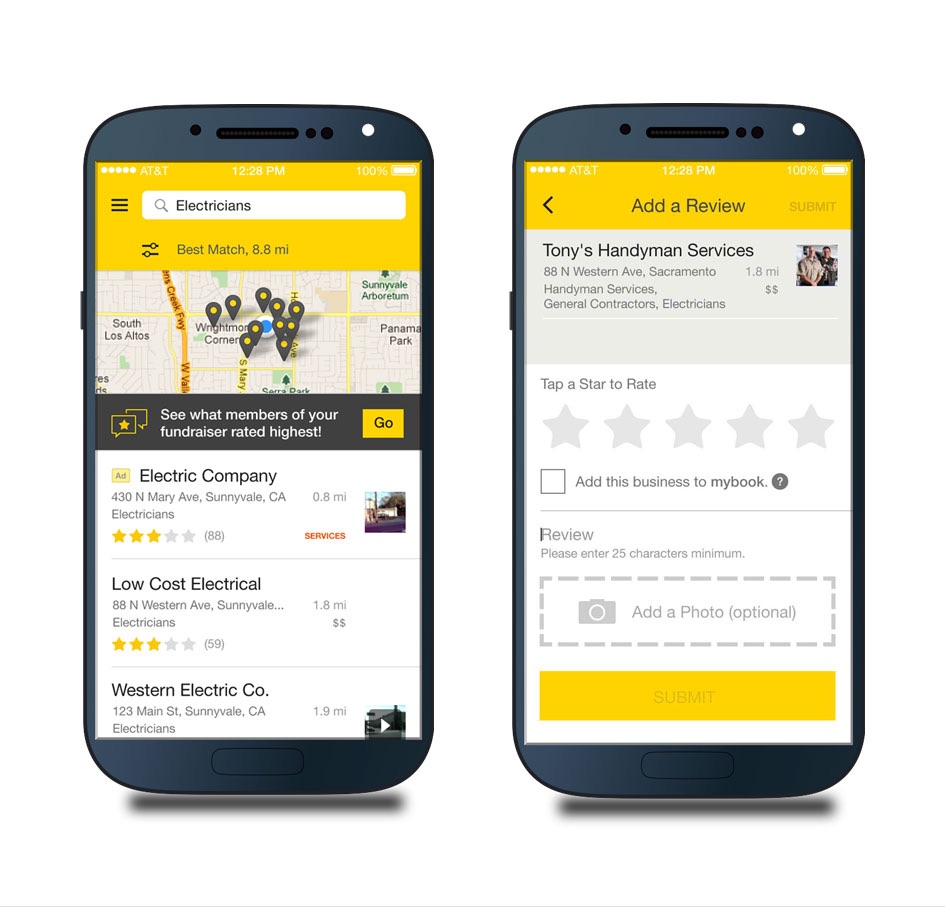
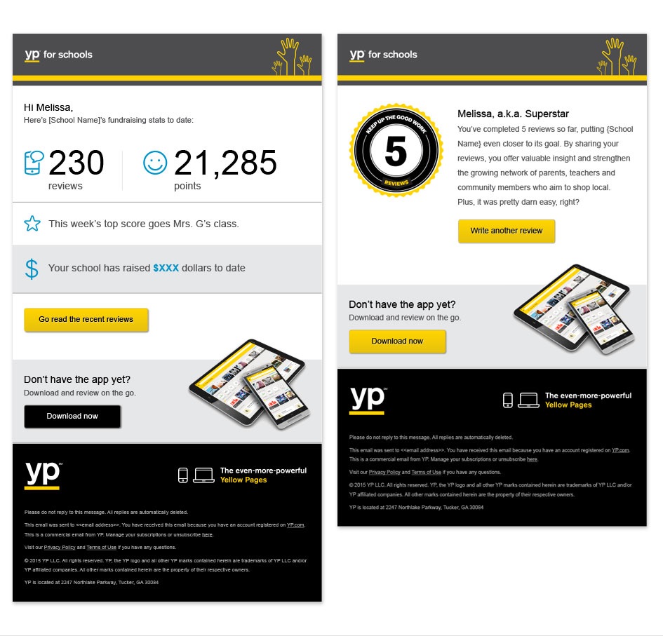
Local search lives on reviews, so YP for Schools gave people a reason to write them. Adults signed up with their school's promo code and reviewed local businesses in the app. Every review earned points, and YP turned the points into a donation of up to $10,000 per school. The brand system stretched to a community program: a landing page, app screens, a leaderboard and progress emails that kept parents coming back.
A brand is a habit you repeat, not a logo you apply.
Give the team a structure, not a style guide
"Can YP...?" plus a real search on a yellow bar worked for a wall, a billboard, a banner and a film. Anyone on the team could make a new piece without breaking the brand.
Same idea, every size
The rocket at Grand Central and the astronaut on TV asked the same question. People who saw both felt one campaign, not two.
Build for the people who sell it
The sales site, the data tool and the product videos got the same care as the billboards, because that's where the revenue was.