
Rebuilding the front door at Thryv
A small-business software company changed what it sold, twice. I led the website through both changes, from the color system and icons to pricing, the path to a sales call and the social work that pointed people there.
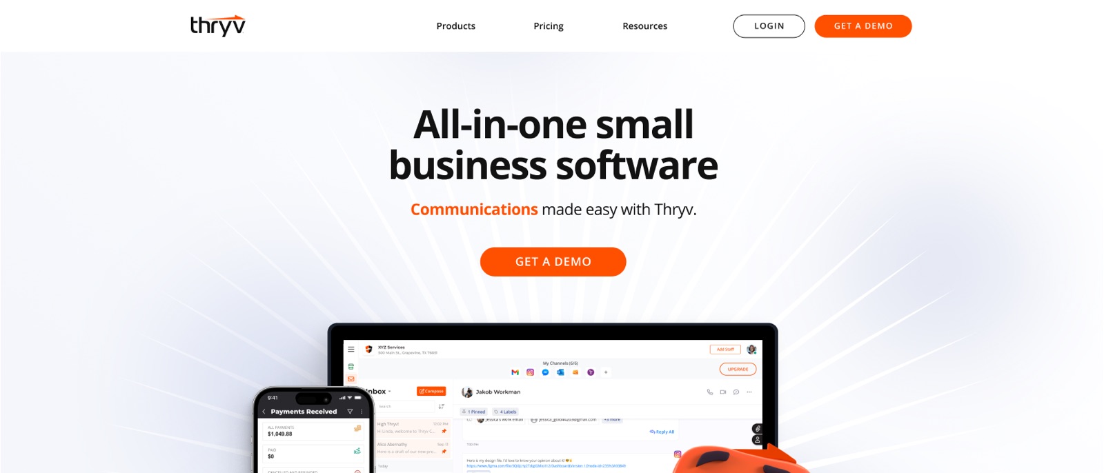
A site rebuild is never one deliverable. It's a dozen workstreams that have to agree.
As creative director, my job was to keep every piece telling the same story and to make the calls when they pulled in different directions. This is everything that sat under that one website.
Strategy
- UX research
- Testing plans and readouts
- Information architecture for a growing lineup
Brand system
- A color for each product
- Business function icons
- Industry icon sets
- Product imagery
Pages
- Homepage and solutions
- A page per product
- Marketplace and API
- Desktop and mobile
Conversion
- Pricing pages
- Guided demo path
- Scheduling with sales
- Contact
Channels
- Carousel ads
- Instagram ads
- Branded headers and banners
First, a company moving into software needed to look like a software company.
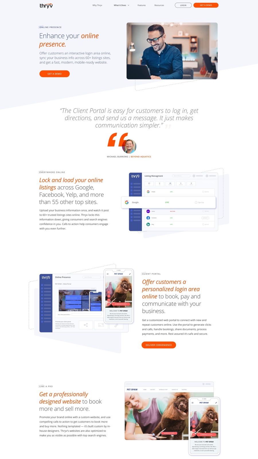
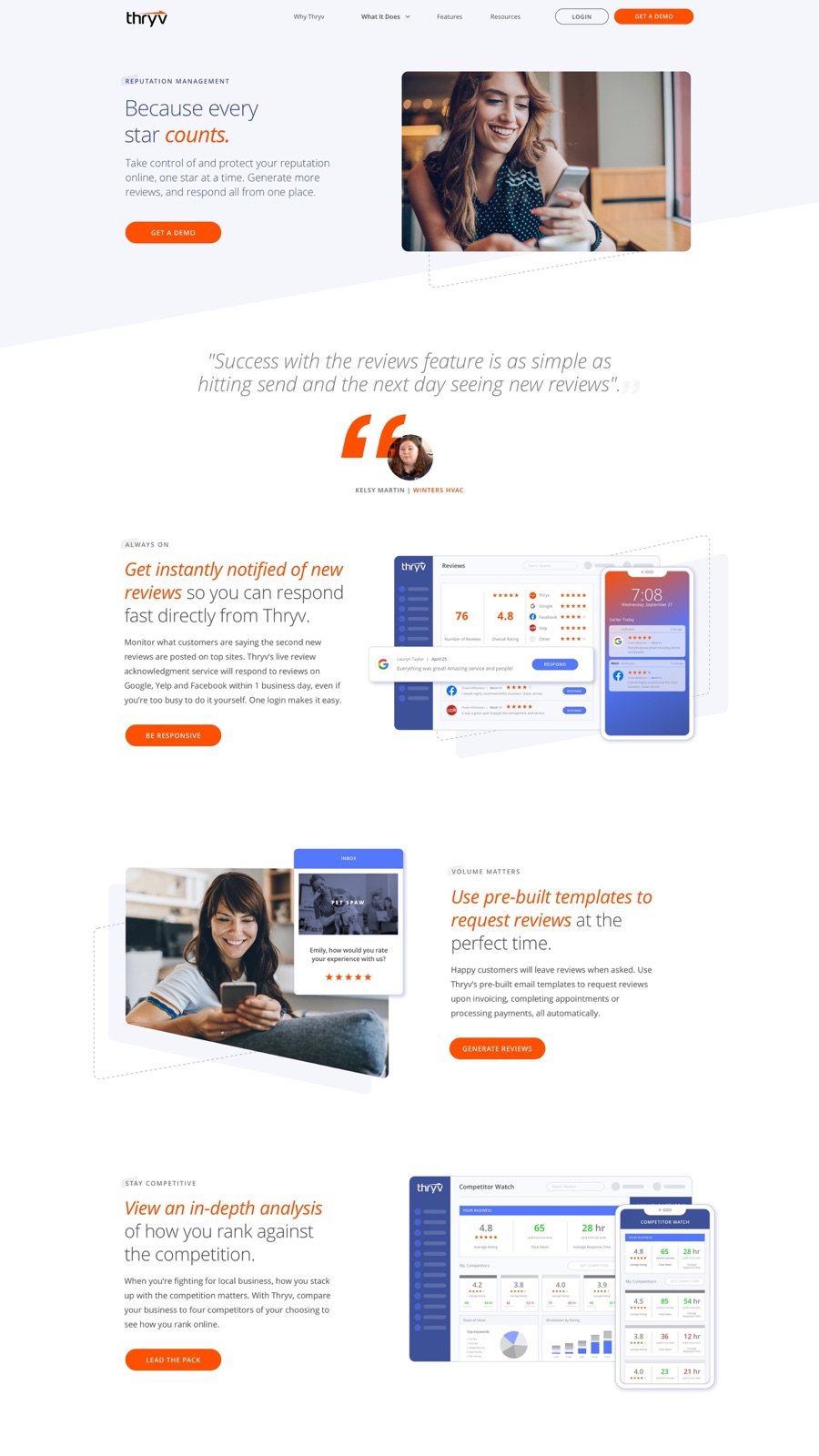
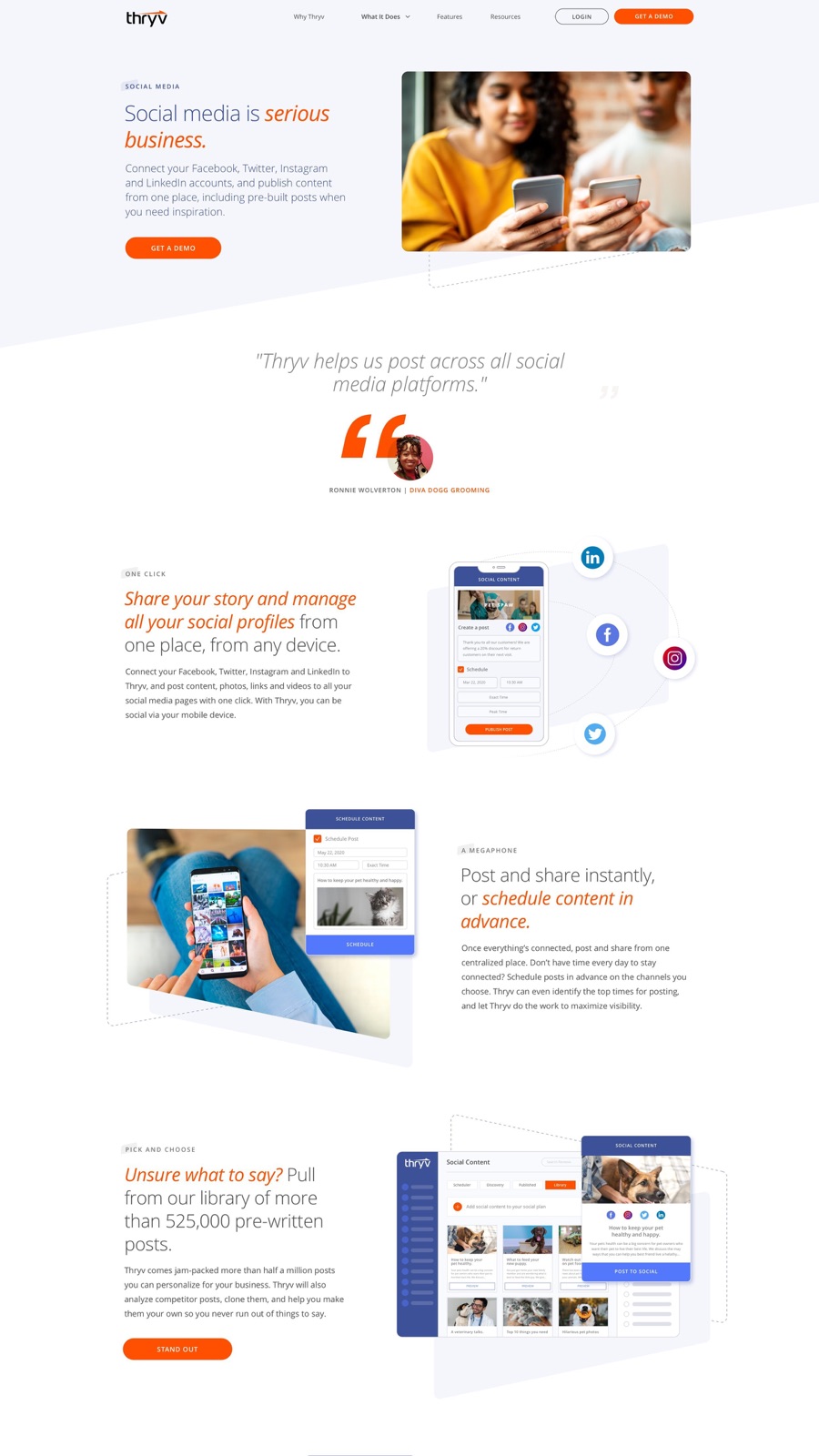
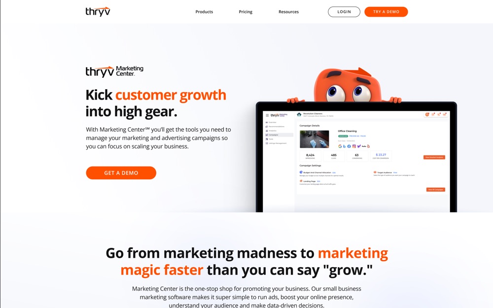
Thryv was turning a set of marketing services into a software platform. I led the branding, UX and UI for a full redesign of the sales and marketing site, with a page for each capability: online presence, reputation management, social media, marketing automation, document storage and Google Business.
Each page needed to show software a small-business owner had never seen. I art directed custom product shots and built integration pages that showed how the pieces connected.
Then the product split into a lineup, and the site had to explain all of it at a glance.
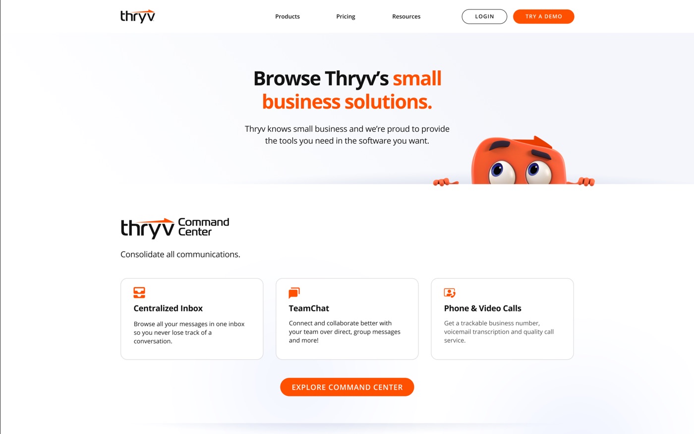
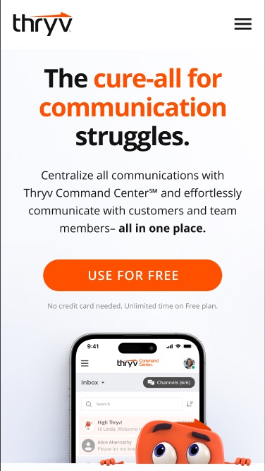
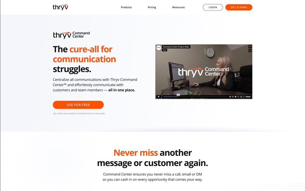
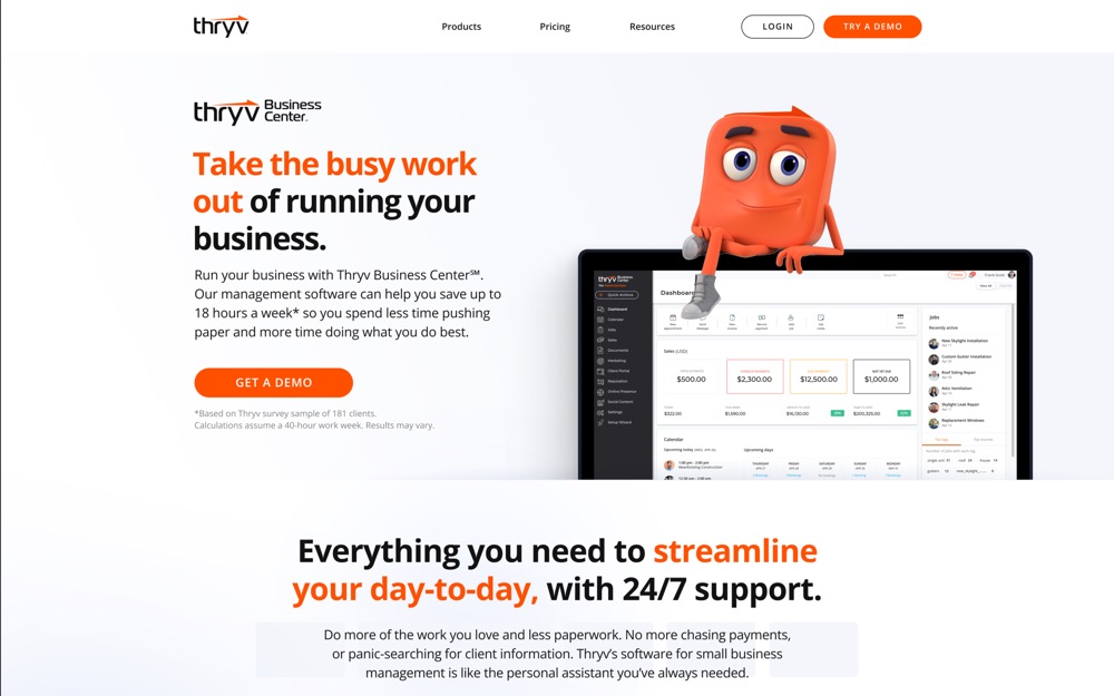
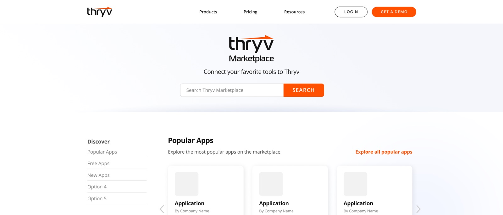
Thryv reorganized its software into centers, each with its own price points: Command Center, Business Center, Marketing Center and ThryvPay, plus a Marketplace for apps and the API. The old site described one product. The new one had to help an owner find the right center fast and still see everything else Thryv sold.
I made the brand calls for the brand team. Every center got its own color, so a visitor always knows where they are, and every center got the same page structure, so learning one page teaches you all of them. I designed each page for desktop and mobile together.

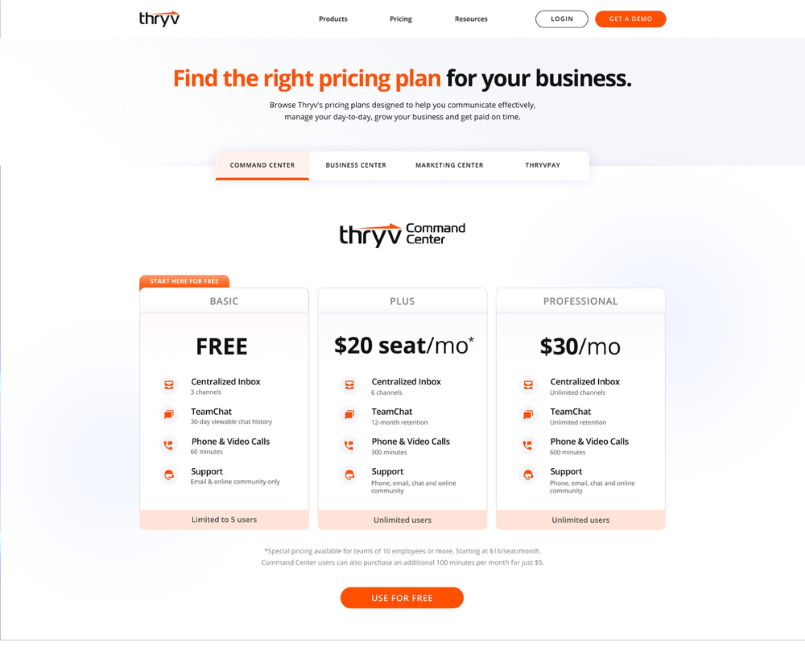
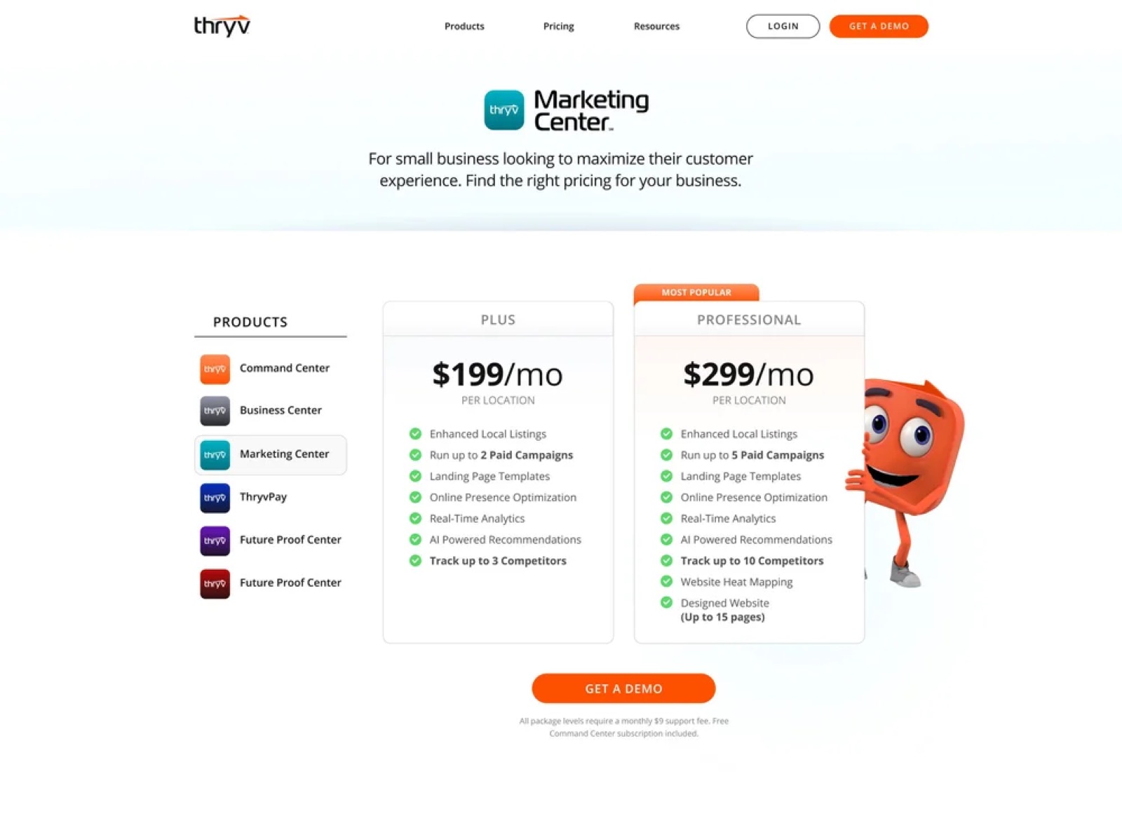
The tidy pricing page tested badly, so we rebuilt it.
The first pricing page put each center behind a tab. It looked clean in the mockup. Testing told a different story. People didn't want to hunt through tabs for a price, and the centers in the other tabs went unseen, which worked against a lineup built on owners adding a second and third product.
After a two-month trial, we replaced the tabs with a single page and a sticky left-hand menu that keeps every center in view, each in its own color. Engagement went up, and visitors started moving between products instead of stopping at the first one. Testing on the layout continued after launch.
The demo request went from a form to a guided path that books the call.
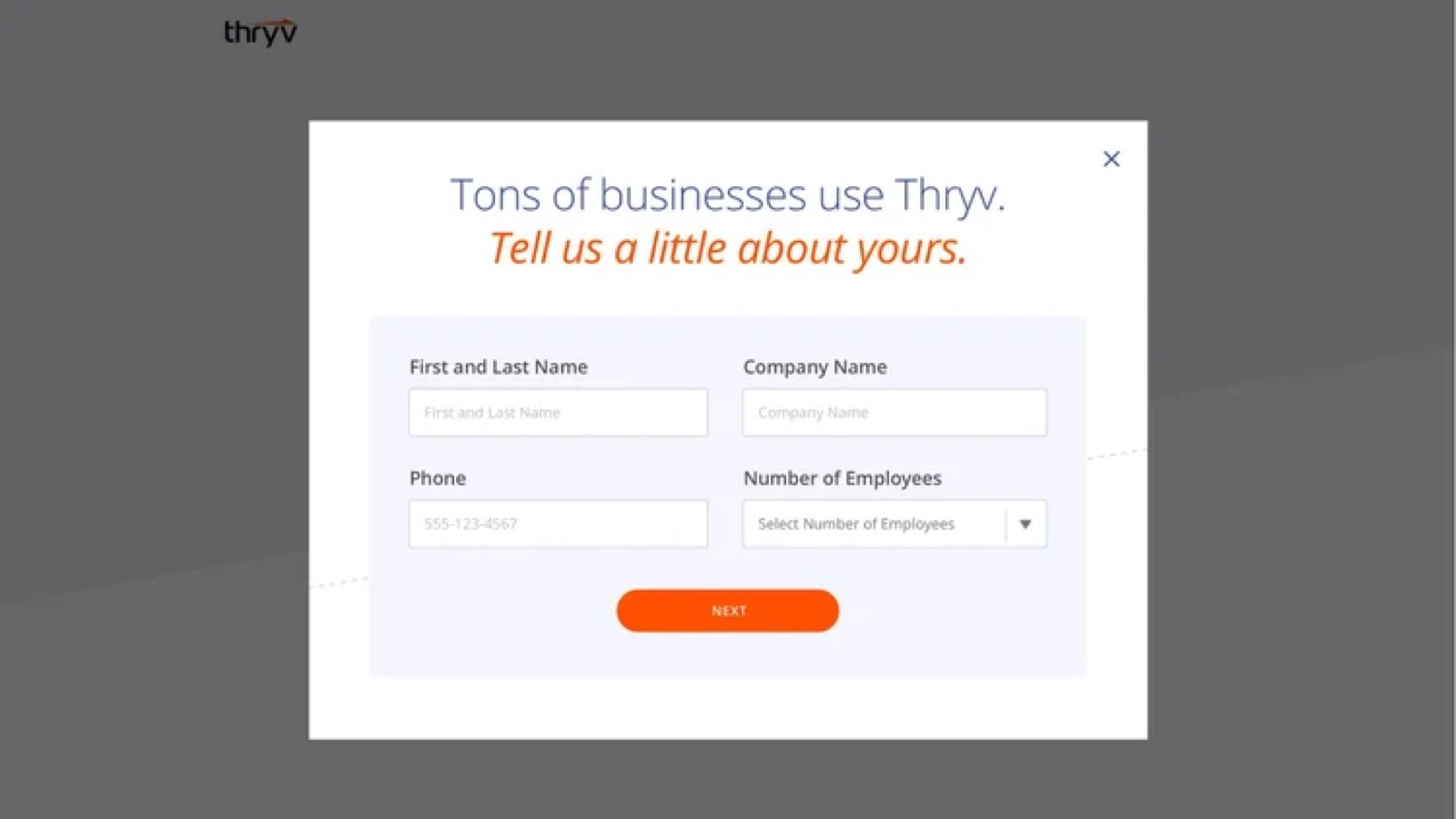
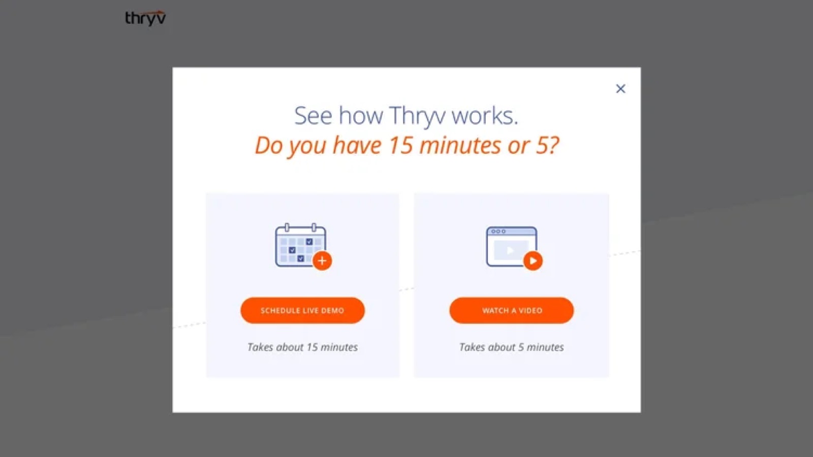
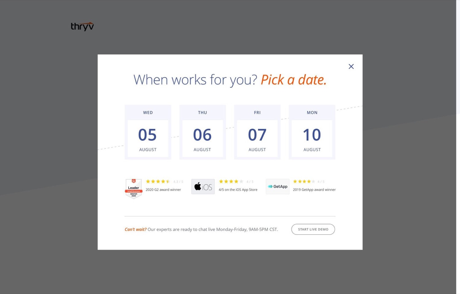
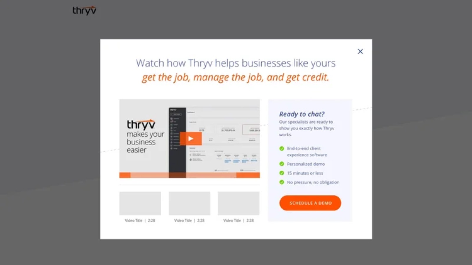
The original path to a demo was a plain form. You filled it in and waited for someone to call. I designed a guided path instead. It asks a little about the business, then lets the owner choose how much time to give: a 15-minute live demo or a 5-minute video. Owners who pick the live demo choose a date with a salesperson right there, with the product's review ratings beside the calendar, so the visit ends with a call on the books.
The first version didn't convert well. A few months of testing reshaped the flow and the interface until it did.
Icons became a language the whole company could use.
With dozens of features across several products, words alone couldn't carry the site. I built three icon families. Business function icons give each feature a symbol across the site, the product and sales materials. Concept icons stand for whole product lines, with a light, high-impact use of the brand colors.
Industry icons do the most work. Each industry, from catering and home services to locksmiths, real estate and wedding services, gets a three-step set that grows with the plan, so an owner can see what each tier adds for a business like theirs.
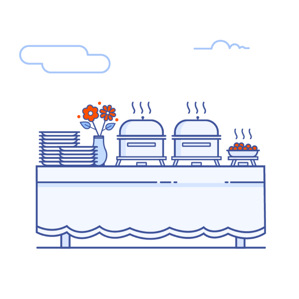
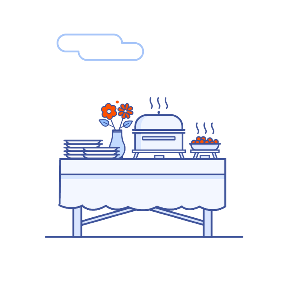
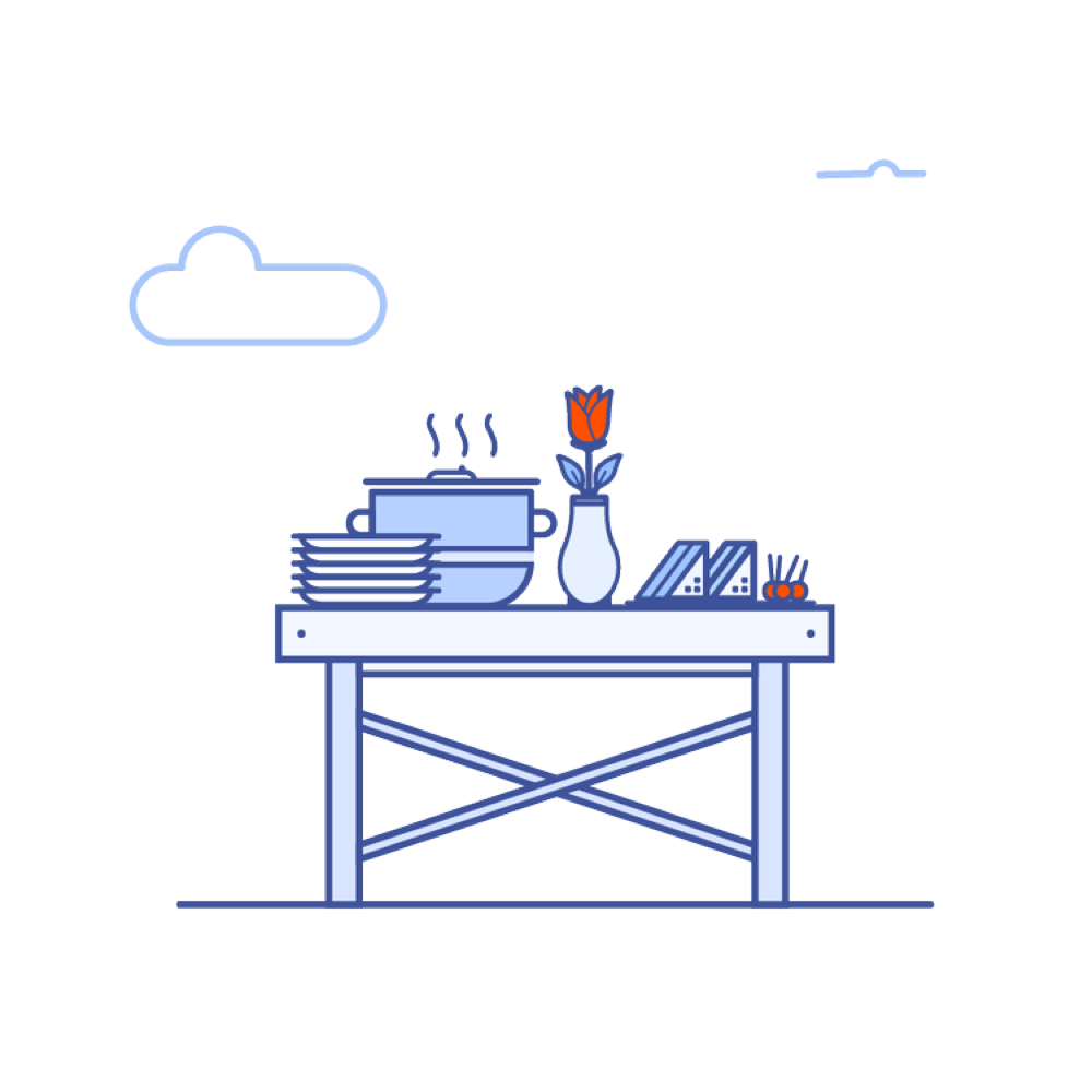
A site that went from describing the product to selling it.
The numbers came from the whole system working together: one clear lineup, pricing people could compare and a demo path that ended with a call on the calendar. I also led the design team behind it with zero turnover, growing it through outside hires and internal promotions.
Three things I'd do the same way again.
Build the system before the pages
Colors, icons and one page structure made every new product cheaper to add and easier to understand.
Test the tidy idea early
The tabbed pricing page and the plain form both looked fine. Real visitors showed us what to change.
Design to the next step, not the page
The win wasn't a prettier form. It was a call on the calendar before the owner left.
The same brand carried into social, where most owners first met it.
A site only works if people arrive. I designed continuous carousel ads, Instagram ads, and branded headers and banners for each platform, all in the same system as the site, so the ad and the page it led to felt like one experience. The work grew leads, organic traffic and followers.